Resilience and Sustainability Collaboratory Identity
The Resilience and Sustainability Collaboratory is a multidisciplinary organization that develops practical, research-driven solutions for environmental and social sustainability.
As the group began partnering with organizations like Skanska, Google and Syngenta, they wanted to refine their identity and strengthen their presence on a national level. The visual identity needed to show both the thinking and the doing behind their work.
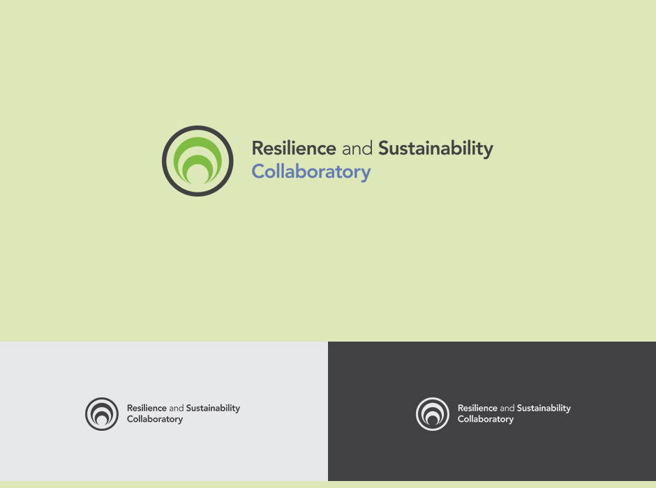
The design focuses on a sense of motion, growth, and renewal. It carries a quiet energy that feels active without being overstated. The logo moves subtly upward and outward to reflect RSC’s core ideas and purpose.


